handpicked.
Your friendly neighbourhood movie recommendation app
Overview
It can be a pain to find what to watch - especially when you’re deciding what to watch with other people. Many times I find myself settling on what show to watch, re-watching an old favourite or closing the application altogether.
This project was one of my pet projects I completed to develop my app design skills. The goal of this project was to create a user friendly app that addressed one of my painpoints with having so many movie streaming services.
Note: This case study was originally created to be published onto Behance before the creation of this website.
Project date: November 2021
Role
UX / UI Design
User Research
Tools
Figma
Adobe Illustrator
Google Forms
Defining the problem
As a frequent user of online streaming services, it can be difficult to decide on what to watch. This results in an endless amount of time deciding what to pick, before eventually choosing to re-watch a show.
Problems
How can I decide what to watch?
It is taking me too long to decide what to watch.
Deciding what to watch has led to arguments.
A show I would like to watch is not available in my region / streaming service.
Solutions
Allow the user to find a title based on their current emotions.
Provide the user with recommended titles based on genres that they enjoy.
Allow the user to blacklist categories that are not relevant to them.
Provide the user with a list of streaming services that are showing the title in their country.
User personas
Based on the given problems and solutions, I have created two user personas that will be the basis of our user research and testing.


User interviews
I then conducted interviews to try and understand the user’s thought process and emotions when discovering what title they were going to watch. Here are the most interesting responses:
If a movie or tv show is not available in your region or streaming service, what do you do?
If it isn’t available in my region I usually use a VPN to view it. If it is not available on my platform I usually have to do some digging around Google to find out where I can watch it.
What happens when you can’t decide on what tv show or movie to watch?
When we can’t decide it usually ends up in an argument about everyone’s tastes, or we end up compromising on rewatching a show we’ve seen such as Brooklyn Nine Nine.
What is your preferred method of finding a tv show or movie to watch?
I usually I use platforms such as IMDB to find the trending shows, or get recommendations from my colleagues. But a lot of the time we end up not liking the show.
When having guests over, how do you decide on a tv show or movie?
Normally we scroll through Netflix and ask each other if we’ve seen a specific show until we find one we all haven’t seen. However, usually some people aren’t in the mood for things like horror or comedy, so we have to compromise on rewatching an old show to pass the time.
Hypothesis
After understanding all of the interviewee’s point of views, I came to the conclusion that creating a mobile app is the perfect solution. It will allow the user to engage in a survey which provides them with title recommendations, they can access it at any time, and it can dynamically show necessary information to the user.
Having readily-available access to find a recommended film that can cater to the interests of everyone involved in the activity helped resolve the problem of not being able to find something to watch.
Wireframes
I then started on wireframes, which has a strong focus on the questions we would ask the user during the recommendation phase of the app.
Colours and typography
I chose to use these colours as I felt that they were very complimentary. I also found that using these colours provided enough variety to the designs which enabled me to clearly section off different elements of the UI, along with being easy to work with when implementing illustrations and imagery.
In the future I could look towards adding a third accent colour that isn’t part of the shades of purple or black.
The typography I found contrasted well with each other and worked together effectively to create a playful tone whilst being easily legible.


The next step was to get started on the final designs.
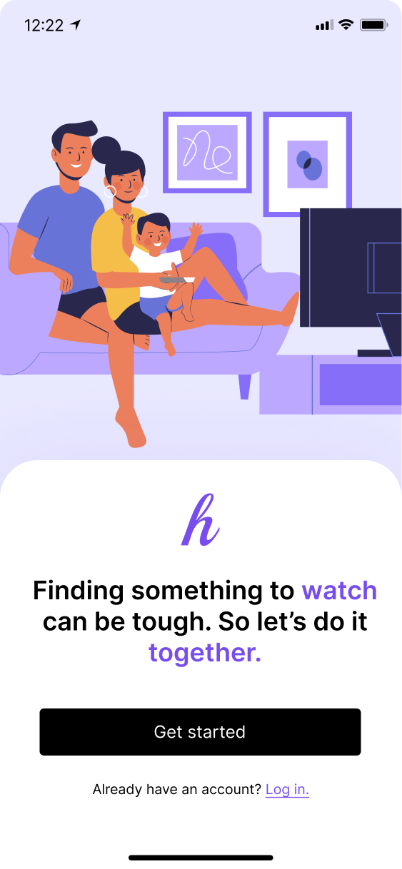
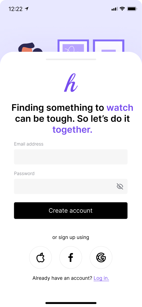
Sign up
For the sign up screens, I was looking to create a friendly experience targeted towards family users who may be deciding what to watch within a group.
The use of illustrations is to try and draw attention to the friendly and social aspect of the application.
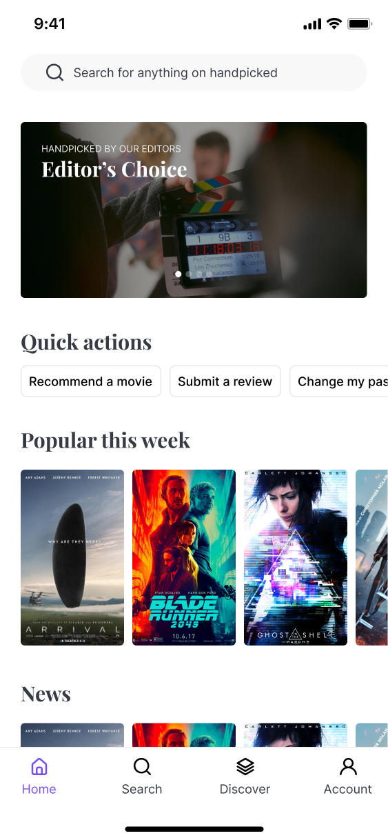
Dashboard
The dashboard aims to serve as the main hub for when the users open the app.
Here I want to surface any self created articles, quick actions to help them jump into different parts of the app quickly, and what’s been trending.
They also have access to the search functionality from here which can be anything on the app - similar to how the Spotlight feature works on Macbook and iOS devices.
Search
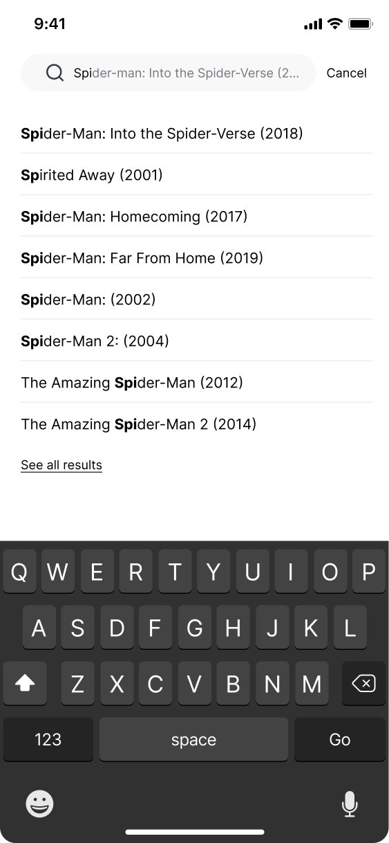
The search screen aims to allow users to find any movie that is listed in the database.
Showing their recent searches helps them jump back into where they last were, and browsing by genre helps serve the desire to look for a type of film, but unsure which film exactly they want to see.
When searching, autocomplete is being used, and bolding the letters used in the search terms with the results helps make it easier to distinguish between results.
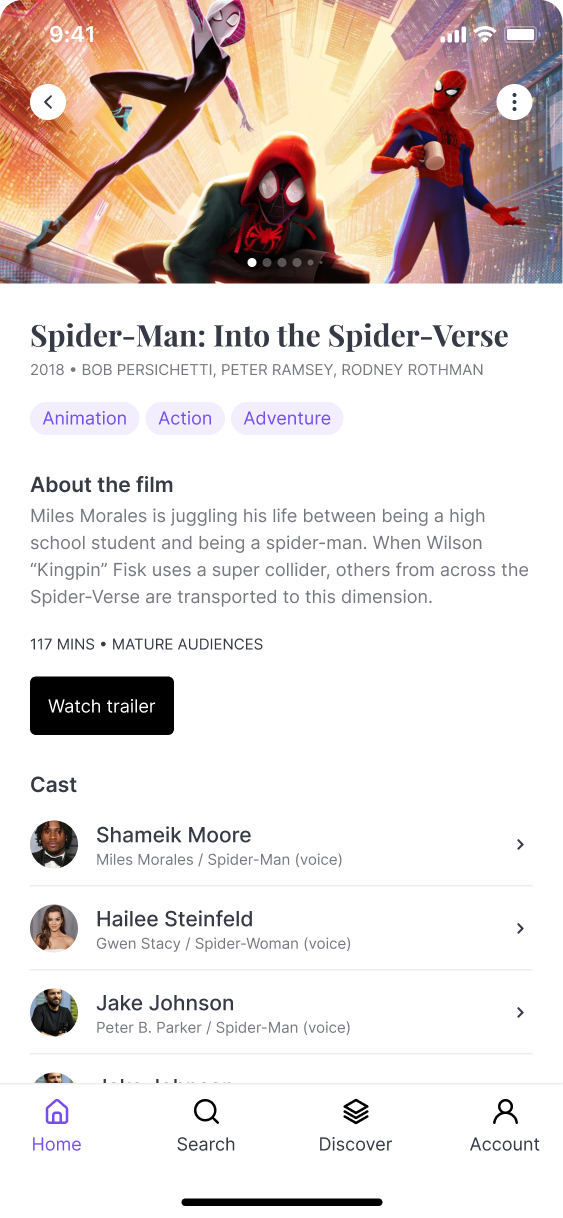
Film page
The film page looks to show relevant information at the top of the page, before diving into more granular content below.
The image carousel features snippets from the movie, and to help guide the user to a decision on watching the movie they will be able to watch the trailer.
They are also able to see a list of the cast and crew - as some users may be willing to watch a movie if their favourite actor is in it.
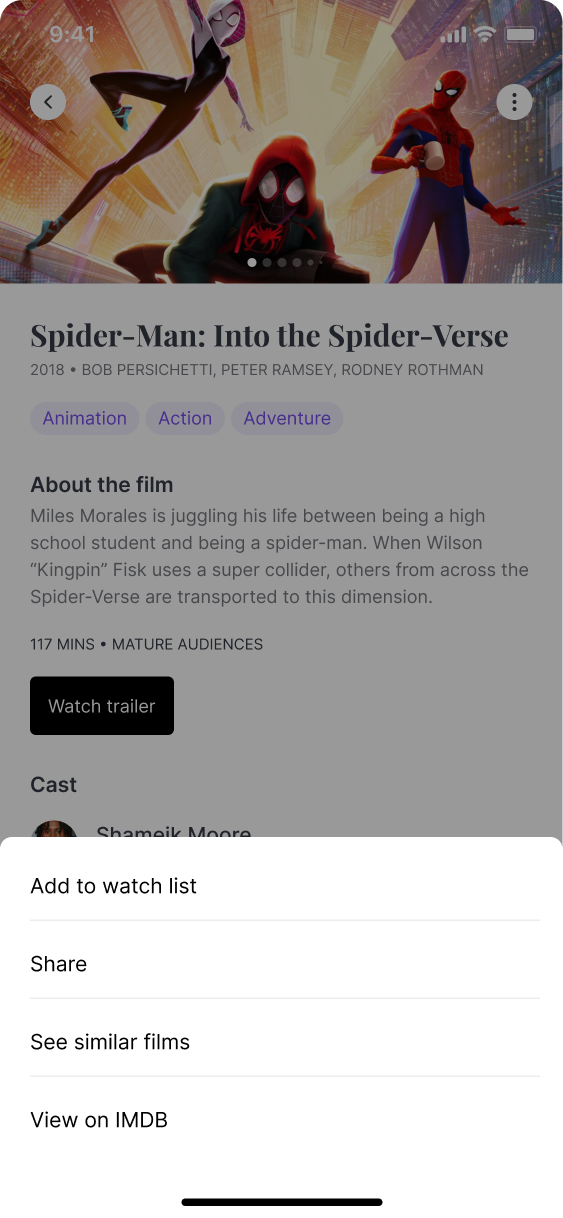
The hamburger button allows them to share the movie, see similar films, add to their watchlist and view the movie on IMDB.
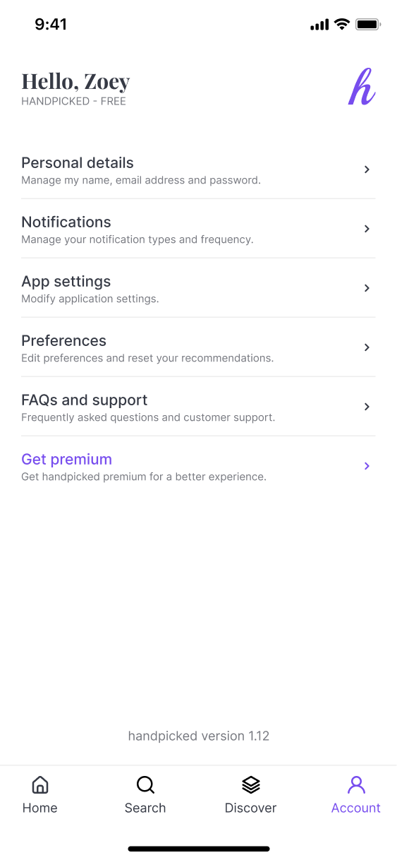
Account
The account page is a fairly standard account page.
This page has been personalised with the user’s name, and their account tier.
We also provide them access to multiple different categories, and list what each category contains to help them accomplish what they need to do in the easiest manner.
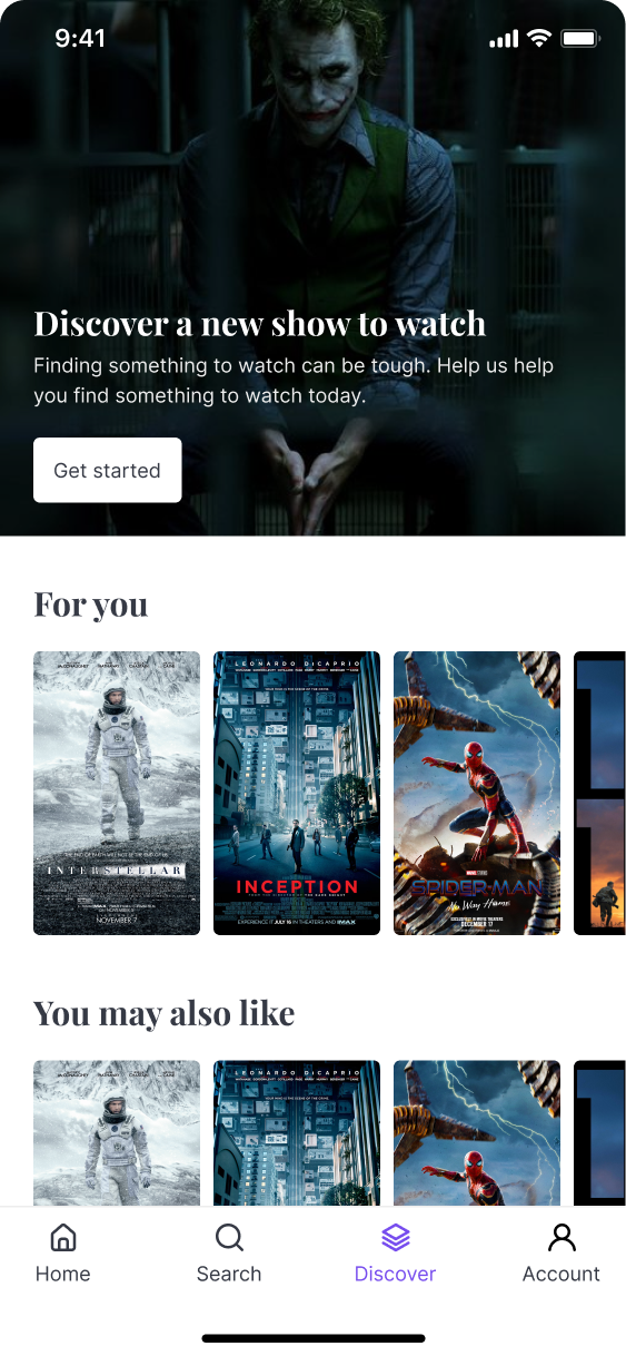
Discover
The discover page looks to provide the user with films that are tailored to their browsing history, liked films, and any previous entries into the recommendation flow.
This page also serves as an entry point into the recommendation flow.
Recommendations - Step 1
The first step of the recommendations flow asks the user what movie genres do they watch. This helps us establish a base on the types of films they tend to watch.
The user is able to select multiple options, and using the secondary colour helps highlight which ones have been selected.
Recommendations - Step 2
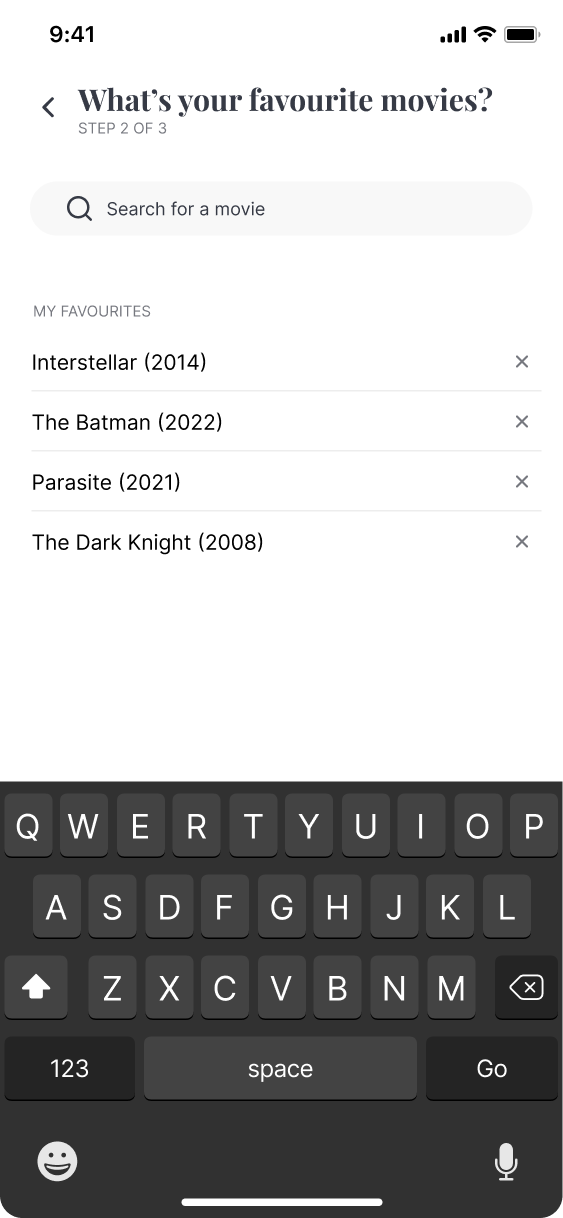
The second step of the recommendations flow is to allow them to select their favourite movies. On this screen they can see what they have previously selected, and remove them as needed. If the user wishes to add more, they can search for a movie.
In the search they are also able to see trending films. This is included because the user might have seen a recently popular film and this would be a good time to surface it since they may be looking for something similar at this stage.
Recommendations - Step 3
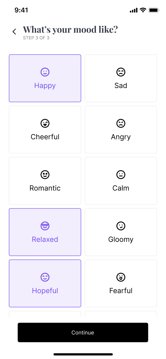
The final step involves the user selecting the type of mood they are in. This is because as a user who may be looking for something to currently watch, they can make a decision based on their emotions.
The reason I have chosen to use multi-select here is because they may be within a group of people, and so there could be mixed emotions so having multiple options can help us provide the best results.
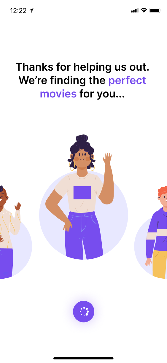
Recommendations - Step 3
The final step involves a friendly loading animation, which cycles between different illustrations while we are fetching results.
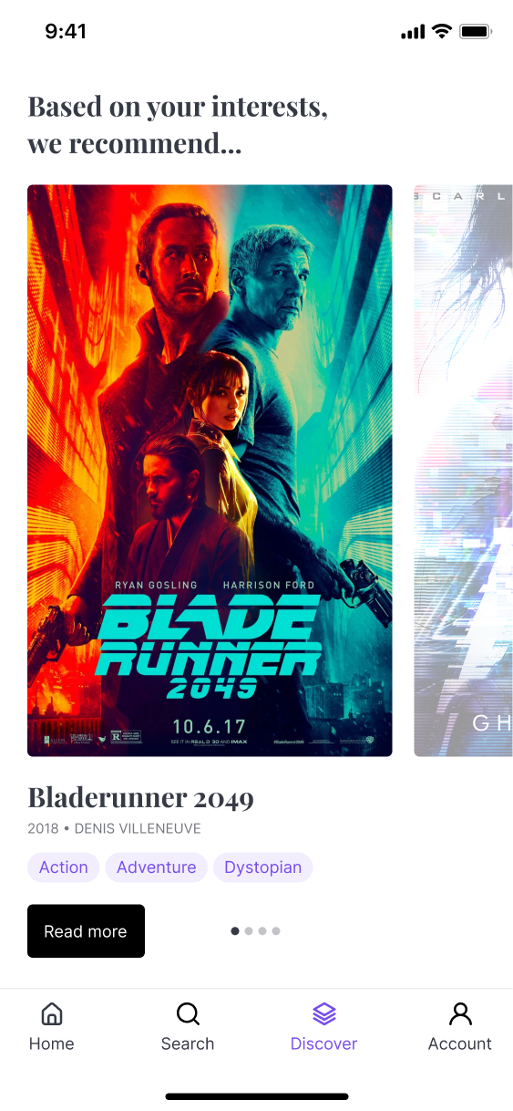
The user is then shown with the movies which we recommend to them based on the answers they provided.
They can swipe through these as a carousel, or click the ‘Read more’ button to go to the film listing page.
Feedback and future improvements
After showing the application design to a number of different users, I obtained some valuable feedback which can be used when creating further iterations of this application. Below are some notable quotes:
What did you think of the colour theme?
I found the colours to be very appealing, but wish it would be available as a dark theme. I like to watch series at night so think this would not blind me when searching for titles.
How did you find the recommendation process?
I think it was quite simple to complete, but at times I found that not enough was being asked of me so felt a little uncertain if I would be recommended something I’d enjoy.
Did you find the app accessible?
The app felt quite accessible to use, but I think the use of white was quite strong. I also thought that every time I open the app it should ask me what I want to watch, rather than show the dashboard since my mood may have changed.
What did you dislike the most about the app?
I think it was quite confusing to have the emotions and genres listed out as text options. I think if there was imagery instead of icons here that would make it easier to find the exact emotion I’m feeling at the time. The icons can feel a bit generic.