
Luxury Escapes
Designing a better way to find flights
Update to the designs - January 2023
As Luxury Escapes rebranded with the release of the new app, the web team also moved to a rebranded design system. This resulted in the final product looking a lot different to the initial designs shown in this case study at the time of writing. To scroll down to see the updated design along with some new design system components, click here.
Overview
I would like to preface this case study by stating that this project had many features being added incrementally (such as the search, and previously selected flights). You may also notice that the design system appears different at the end compared to the initial designs and that is due to us moving to a new design system during this time period.
As Luxury Escapes was evolving as a business to cater to more of our customer’s needs, we wanted to offer our customers standalone flights. Traditionally we have only offered flights when they were attached to hotel purchases, but this posed many issues with customers who were not satisfied what the carriers we were supplying, and our existing flow proved to have limited functionality.
Improving the way our users can search for flights on our website would ultimately enable an easier purchase decision. We had to note that our users are typically shopping for luxury travel, and are of an older demographic. We had received feedback about our flights process needing to be improved from existing customers; and decided that being able to tackle the issue of the existing flights flow being subpar along with adding standalone flights would be a good way to approach this challenge.
Tools
Figma
Miro / FigJam
Confluence / JIRA
Role
UX / UI Design
Developer handoff
Understanding the problem
Our customers are price-driven, however also expect certain standards when it comes to the content we offer them. With the addition of new airline carriers and standalone flights, we want to still provide customers with the ability to find the more premium flight options, and allow them to find flights that best suit their needs and purchasing behaviour and also give them more control over the flights that they are seeing. For the customer’s experience, three key deliverables are required:
Allowing customers to search for flights to any destination for return, one-way and multi-city
An improved way to filter and sort flights
A flight tile to match our new design system
Across mobile, desktop and tablet devices
Once we had defined the problem, we needed to discuss with the business stakeholders on what is the best way to measure success.
How is success measured?
We expect to see lower drop-off rates within the existing hotel + flights flow by providing recommended flights, and also a successful launch of the standalone flight search. As introducing standalone flights is a new vertical for the website, success will be determined over a longer period of time. As there is a large amount of backend work needed for this project, UX and UI changes will be rolled out incrementally after the MVP launch.
Competitor research
After determining our user problem and the requirements, we began researching how other competitors are selling standalone flights. These competitors included Skyscanner, Expedia, Google Flights, Kayak, Trip Advisor and many others.
Competitor research conducted by our user research team and organised using Miro and Figma.
After analysing what our competitor offerings were, there were some key bits of functionality that we found were necessary which other providers were allowing:
A way to filter their flights in a quick manner
See the pricing for different carriers at a glance
Show the inclusions of a flight easily (this aligns directly with how we put inclusions first for our hotel offers)
Sorting flights by a recommended method, cheapest, fastest and other (including
See my previously selected flights if using a stepped process
Wireframes
After conducting our competitor research, I had then begun wireframes.
When designing the wireframes the first thing I had looked towards accomplishing was surfacing the Recommended, Cheapest and Fastest flights on the initial screen for the user. As one of our key goals was to create a smoother process towards booking a flight that we can recommend to them based on what they may be looking for, I had initially found this to be a good option.
These wireframes then became our initial designs for this screen, once we had decided on what the interface would look like after multiple rounds of feedback between the rest of the design team, project manager, and flights team.
The first wireframes of the new flights screen. Many elements from here were either removed, or later became modified to better fit the final layout (click to expand).
Initial designs
After getting feedback on the wireframes, the next step was to implement this feedback into some form of UI that we could use to start conducting user testing. As our research found that it was more popular for customers to be using desktop to book flights, we had decided to have a desktop-focussed approach towards our initial UI for testing.
In this version of the interface, we ensured that pricing was very clear to the user, as well as being able to sort and filter as they please. However when we start user testing, we quickly found that this wasn’t the case, and these designs need to take another look.
As you can see in the designs, that while I had made it clear to the user which were the recommended, cheapest and fastest flights - it was at the expense of valuable screen real estate. We took this user interface into our first round of testing with existing customers, and we got some valuable feedback.
Initial designs which were to be used for user testing (click to expand).
User testing
Our research team had sent out the new designs to our existing customers, and we were able to receive some valuable feedback:
FEEDBACK 1
“I find the page too busy, and I’m not sure whats the difference between the three at the top and the rest of the others.”
FEEDBACK 2
“I think it will be hard for me to decide a returning flight after I’ve selected my departure flight because there are so many different combinations. It should be a bit more straightforward.”
FEEDBACK 3
“I would like to know if things such as baggage, meals, class, are included and be able to change my airports and travel dates easier.”
Based on all the feedback we received, these three stood out the most. My key learnings from the user testing were that:
By having all the features that a customer could use to find the perfect flight, I am actually preventing our core user (older demographic who are not as tech-savvy) from using our product. Thus, I would need to scale back my current designs and also consider our core user when designing future products.
Having the three options displayed at the top seemed like a good idea initially, til user research found that customers were tending to scroll past and look at other flights. This showed us that customers were more inclined to find flights that best suited their lifestyle and use filters, rather than take what is given to them. Looking for a more subtle way to show a recommended flight would be the ideal scenario.
Displaying both the departing and return flight in the same tile can be confusing for users. They might find a specific departure time but then have to dig through hundreds of other results to find a return time they like. Breaking this process up into two separate steps would be much easier and also better accommodate for multi-city flights in the future.
For the inclusions, we did have a ranking question within the user testing which required them to sort by their most important inclusions. We then used this data to form a new flight tile which showed the most important inclusions in an initial view.
There was no way to change your flight date, passengers or airports after conducting the search, so surfacing this would be highly beneficial for those looking for the best deals.
Final designs (before the rebrand)
After all the user testing, the next step was completing the final user interface. After taking in all key learnings and applying them, I was able to start work on the components which would later build out a flexible design system for all flights.
This went through several rounds of internal reviews, from multiple steps of preferential testing, design team shoulder checks, weekly check-ins with the flights department and finally presenting the designs at the company all-hands meeting in a live Figma demo.
Before diving into the user flow and how components were created I think it is important to see the overall outcome of the page. Overall, this page looks much cleaner than the previous designs and feels a lot more balanced with how a typical flights search should work. The user is able to adjust their search at any time, select their filters, funnel into a specific airline, and also sort their flights quite easily.
The adjusted layout really helps us call out the flight we recommend, which is fully customisable by our flights team and can be based on factors such as price, flight time, travel time, airline and more.
The stepped flow
Before diving into how the other components were created, it is important to understand how the user flow will work. As the feedback from the initial user tests showed that having both legs of the trip displayed under the one tile can prove to be confusing, separating this process into a stepped flow would prove to be much simpler, and easier to select each flight in isolation. Below is a quick demo of how this functioned:
The final user flow for selecting return flights (click to expand).
As shown in the demo, upon selecting the departing flight, we show the customer the available return flights that are applicable with their initial choice. Here they are still able to adjust their filters, select a specific carrier, while having the ability to see their previous selection and change it if needed. We also ensured that user can see all their inclusions and flight information, to help them make the best decision for their second flight.
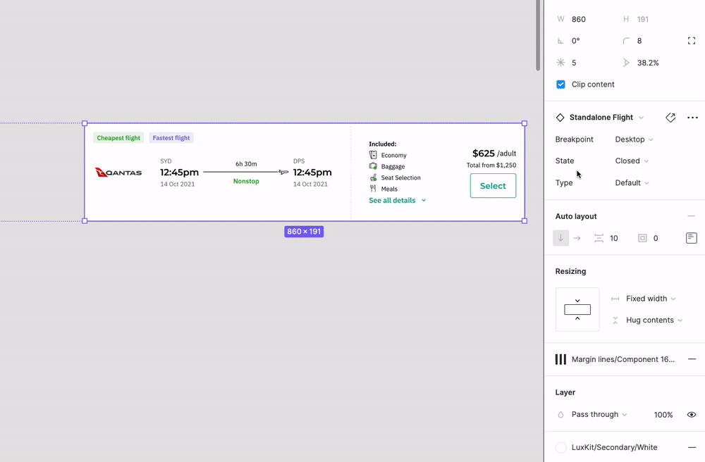
The new flight tile
Moving into more specific information around the flight tile, there were some key things I had to ensure:
Relevant information on the flight tile is shown (as ranked during user testing)
Compatible across all devices
Valid for flights with/without baggage, low cost carriers and a recommended flight variant
Created using Figma variants and ensuring maximum compatibility across the design system
The flight tile variants with base components to ensure maximum flexibility.
While this took quite a lot of work, the end result was very satisfying and ultimately enabled other design teams to use these tiles within their own projects, all controlled from this single flights design system. As a design team, we were now enabled to switch up the type of tile shown based on our needs, with full responsiveness.
A demo of how the variants were able to allow full flexibility on the flight tile using a main component with base components.
Developer handoff
The final step prior to development was to complete handoff. As I had engaged with the developers from an early stage, this became a lot easier to accomplish as they were well aware of both the UI and the UX. The use of Figma variants also helped quite a lot as the developers were able to clearly see the different states for things such as the search bar or the flight tile.
I also used redlines to help map out some of the granular components. I wanted to make it very clear to the engineering team on each of the component variants, error states and messaging. Sticky notes outlining functionality for components that required a bit more context on functionality were also used where necessary.
I wanted to make sure that a lot of time was dedicated towards handoff to ensure that others stakeholders, developers and designers with little context of the project would be able to understand the component structure and design thinking that was required to complete the project. I believe that having a clear and articulate handoff process helps ensure there are less inconsistencies between design and development.
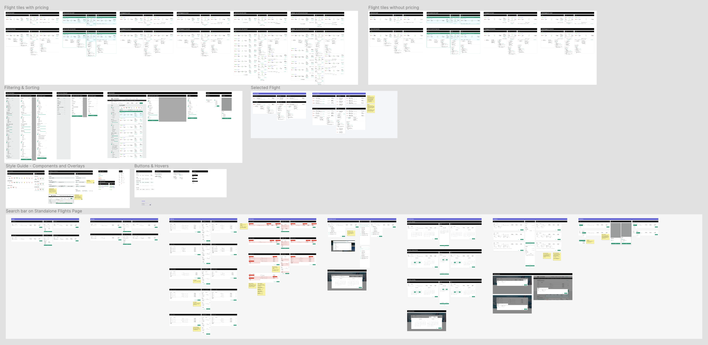
The developer handoff page in Figma, showing redlines, all variants, and annotations.
Final Design - After Rebrand
Over the past few months, Luxury Escapes underwent a rebrand after the launch of the new mobile app. This involved us updating the web design system to match the new look and feel of the app, including new fonts, colours and the addition of many new components, including chips.
We then used this rebrand as an opportunity to look into the existing flights designs by adding more chips. This gave the customer some quick filter options, along with using them for the sorting. We were then able to use more uniform icons for the flight inclusions, and improve the carrier bar to give more indication that it can be interacted with.
Overall, the rebrand and updated design system gave us an opportunity to really improve the visuals and give our flights page a more luxurious feeling, and provide us with some more room for improvement when adding in new flights options such as multi-city and flight bundling.

The new flights search results page after the rebrand.
Conclusion and takeaways
We were successfully able to implement the designs using a staged rollout, with the last to be implemented are the new flight tiles. The flights team has done a phenomenal job on releasing not only the return flights flow for the new UX, but as well as the one-way and multi-city flights.
Three key takeaways from this project are that:
Creating the best design can take a lot of feedback. While this project did take quite some time, we are overall very pleased with it. I noticed a lot of key contributors that while could be limited technically, possess a wealth of knowledge about the product which has only further increased my understanding of how flights are booked, how we read data from our APIs and how we can best work between departments.
Design thinking and testing is incredibly effective. We went through several rounds of user testing, internal design reviews, development reviews, and finally presenting to business stakeholders before starting development. All of these sessions involved how we can further improve the design, user flows and how do we consider the future state of not only the product, but also the website as a whole.
Get engineering involved early. Getting the development team across the UX early on was very helpful in ensuring they are aware of what we are expecting the user to do, and also create the best working relationship when it comes to handoff. Getting our engineering team involved early enabled me to create not only an effective developer handoff, but also best assess our technical capabilities when creating the designs.
If you made it this far I’d like to thank you for taking the time to read what has been quite a lengthy case study on how we designed a new and improved flights experience at Luxury Escapes.
Interested in seeing how the project turned out on the live site? Click here
Want to hear more about the project or the work I’m doing? Get in touch.